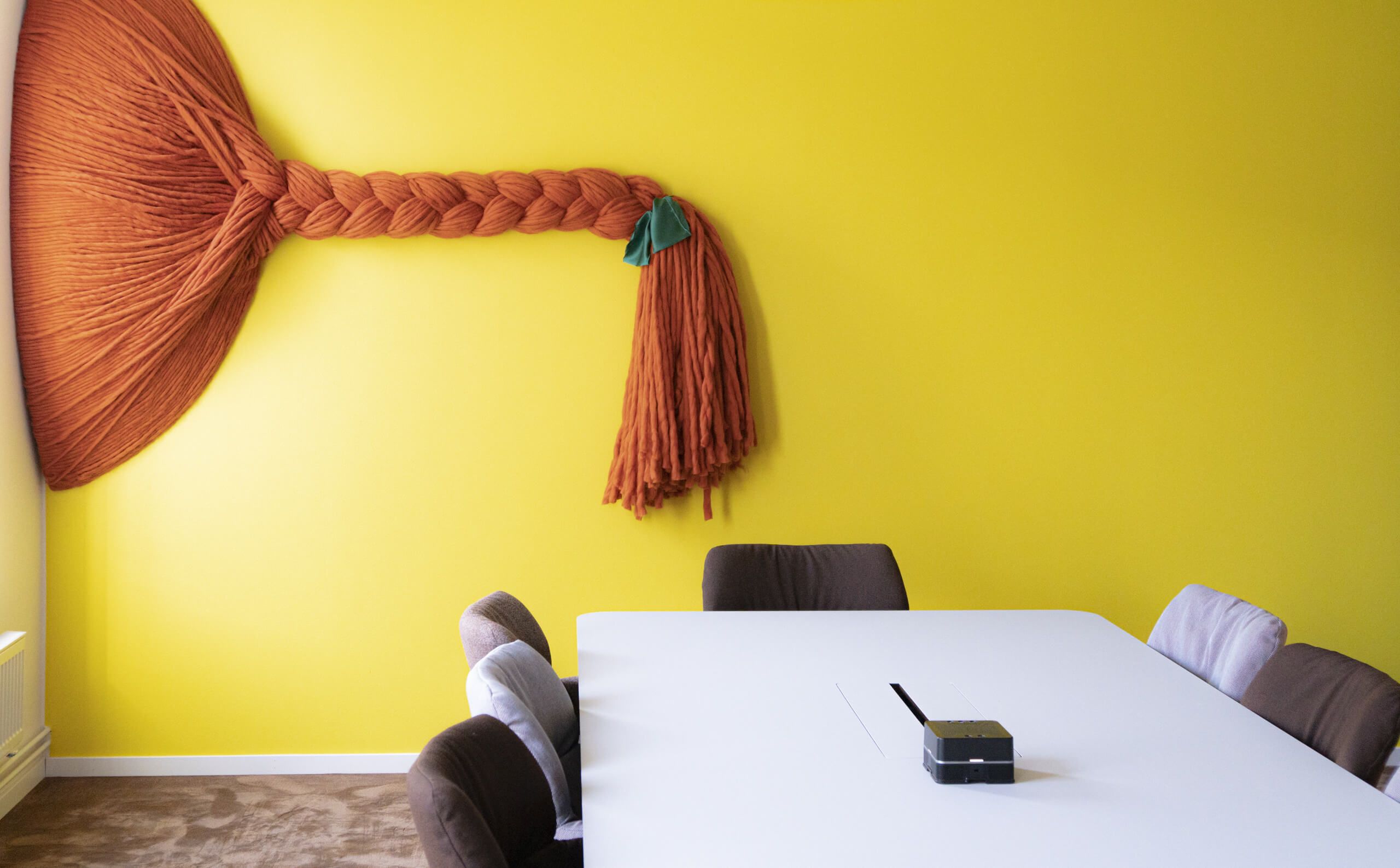
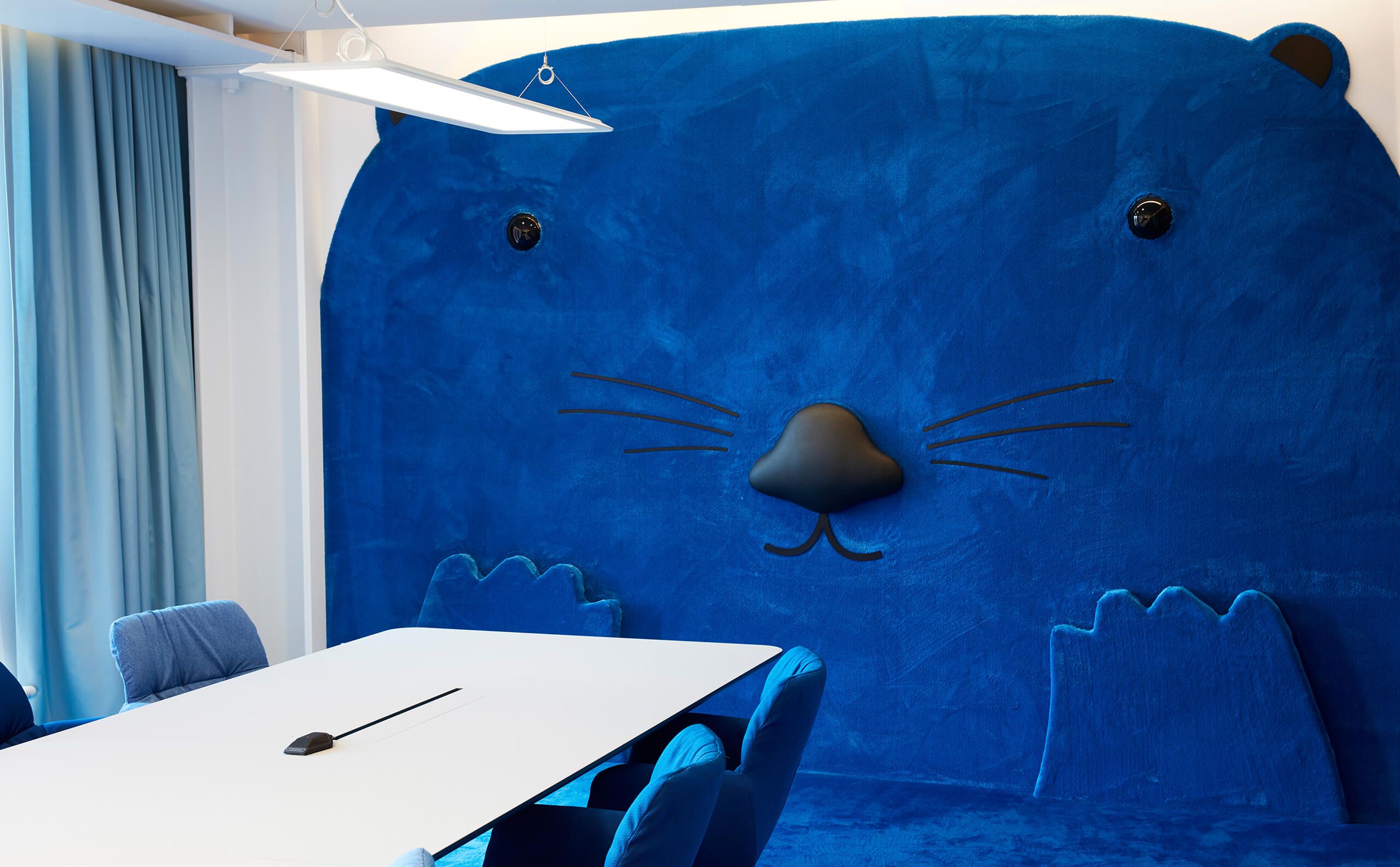
Google – As easy as A, B, C. Building an intuitive wayfinding and inspiring environment for Google Stockholm HQ.
Branded Environment / Wayfinding / Strategy
We were selected to develop a wayfinding strategy/system and branded environment for Google’s Stockholm HQ. Here, each meeting is booked on a minute basis. Streams of international visitors pass every day and employees need to find the right room on the spot. At Google, there is no time to get lost in the corridors. How could we, with room names and graphics, reflect Google's innovative mindset and playfulness - and at the same time simplify navigation in a very hectic environment?
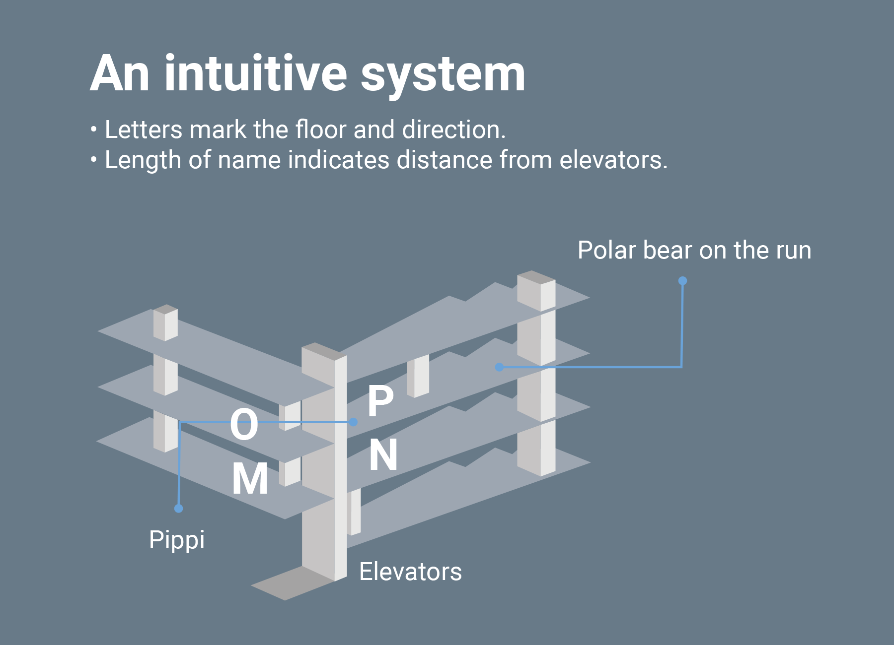
Can we get people to find a meeting room in a building, without a map or directions – just by knowing the room's name?
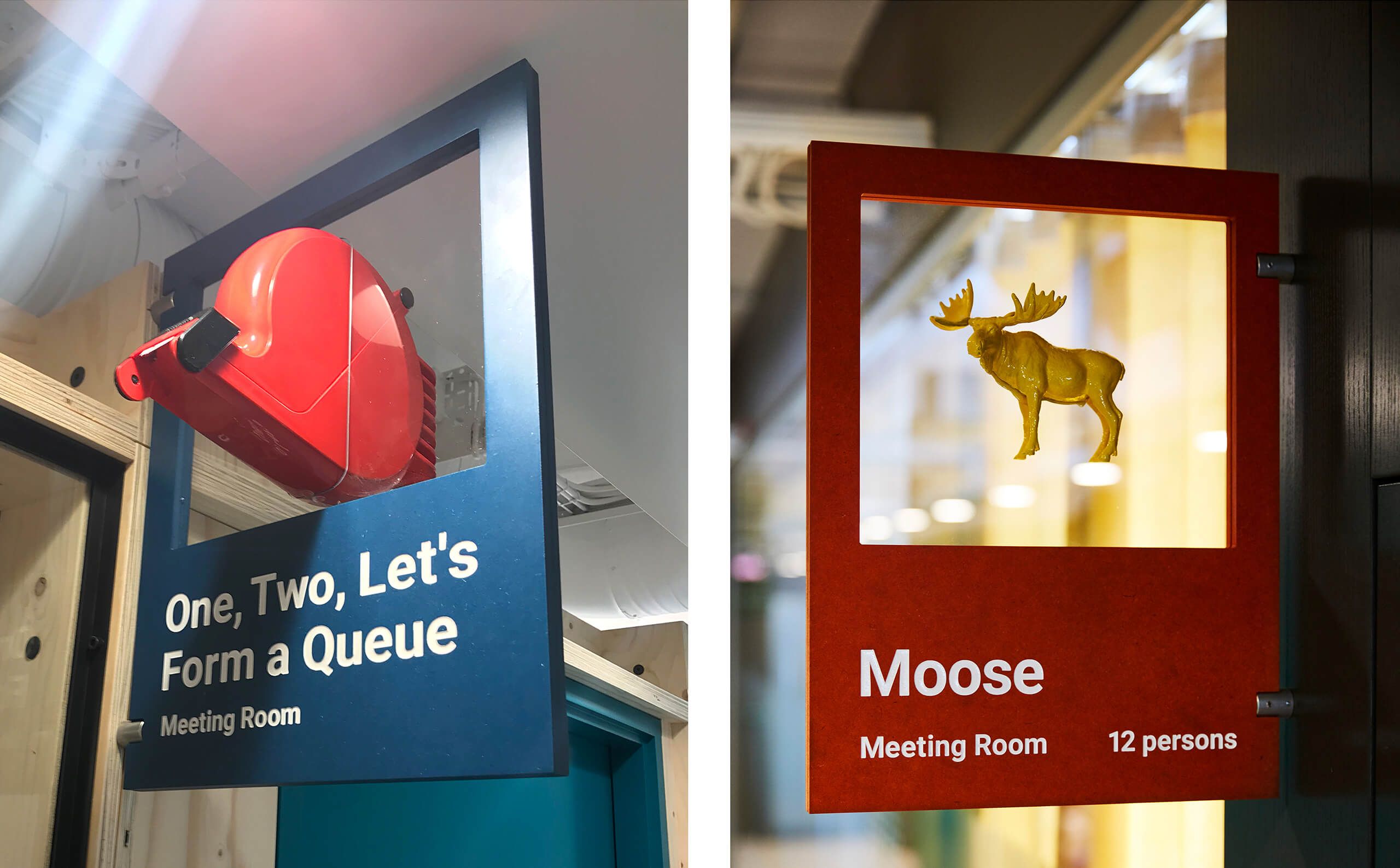
Each floor of the building was given two letters - one for each wing. In the M-corridor, all rooms were named after M. The length of the room names also indicated the distance to the lifts. Short names = near the elevators. Long names = far from the elevators. With logic and humor, an intuitive compass was formed.
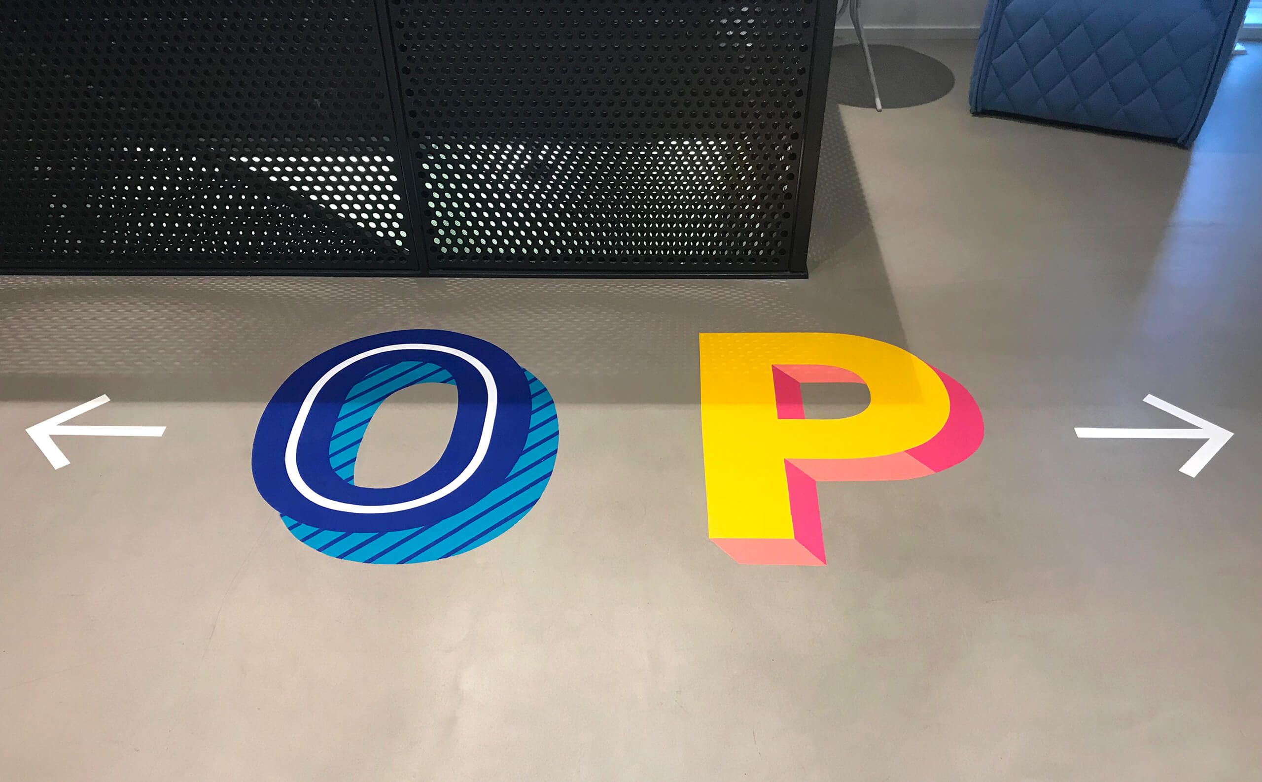
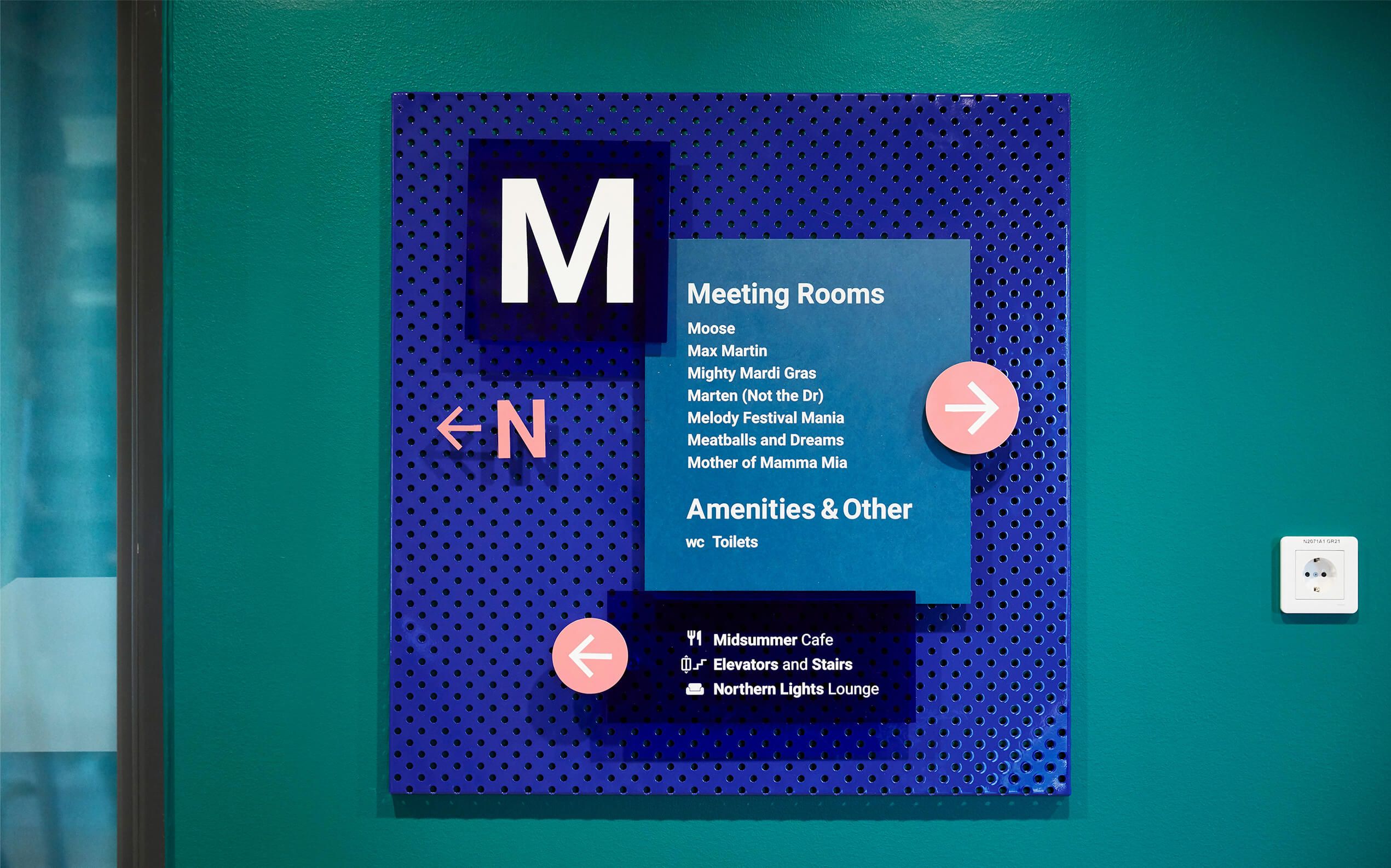
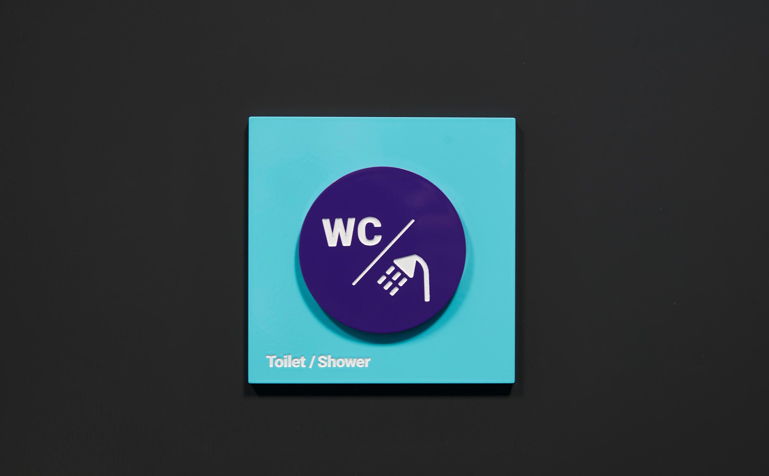
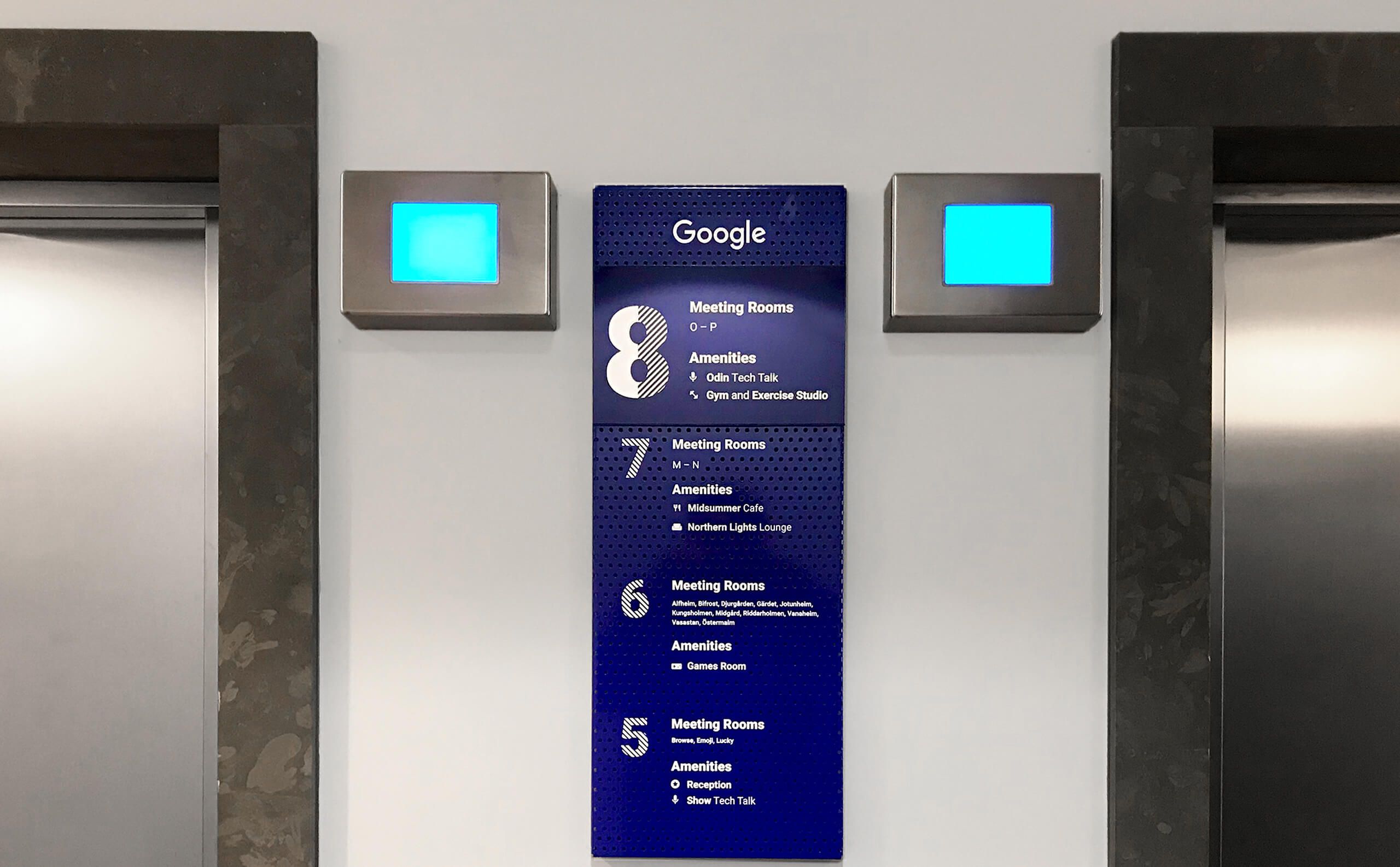
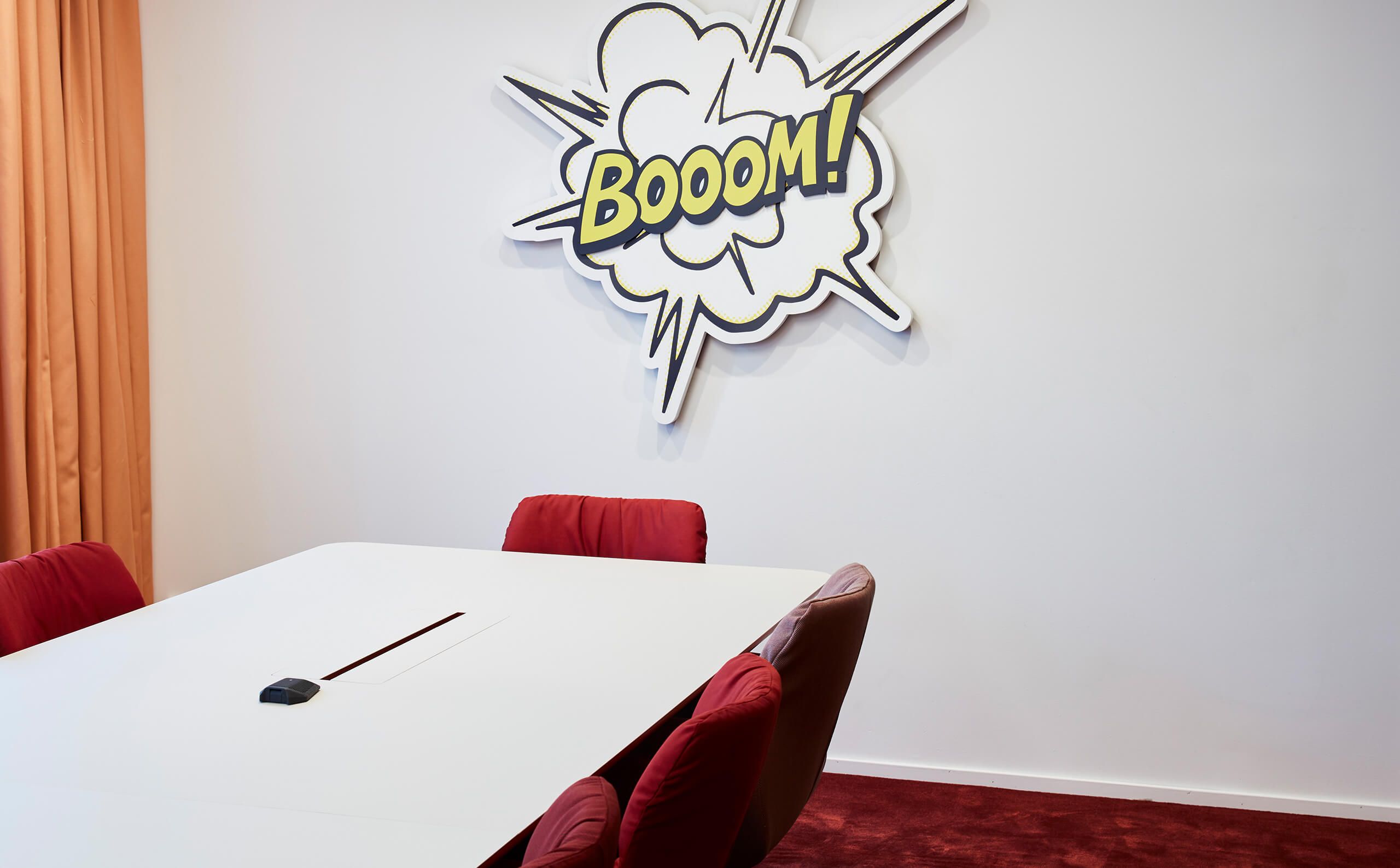
Based on Google's own "material design", we interpreted their digital expression and let it take place in the physical space. Mesh, lacquered sheet metal and vinyl ran through the signs, at the same time as each meeting room was given a name and visual identity based on curiosities about Sweden. Through local anchoring, the office space was filled with personality. Without sacrificing graphic guidelines or clarity.
