Medcura — A health care cunsultant that goes the extra mile.

Branding / Strategy / Digital design
Medcura is a health care consultant company that staffs the industry with everything from doctors to therapists. At the centre of their business is honesty and care taking, for both patients as well as employees.
They offer flexible working hours and freedom of choice for an industry sector who otherwise dictates the conditions for its employees. Medcura has a warm an inviting feel and this is how they differentiate from their competitors. Working for Medcura should be inspiring and they want their consultants to feel supported while they focus on taking care of others.
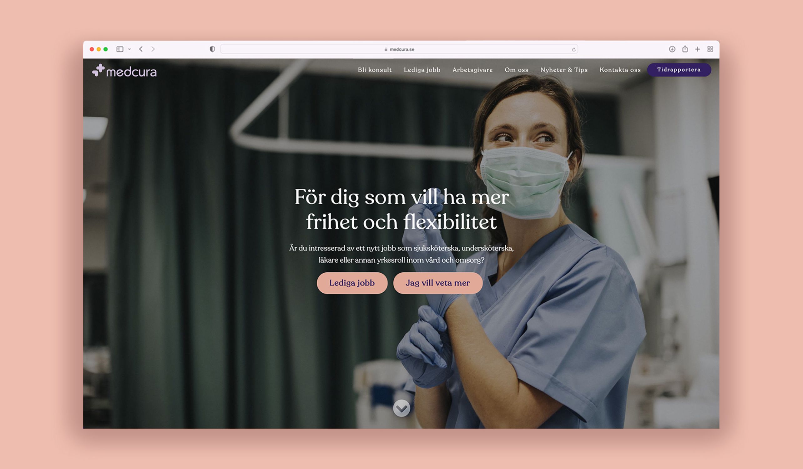
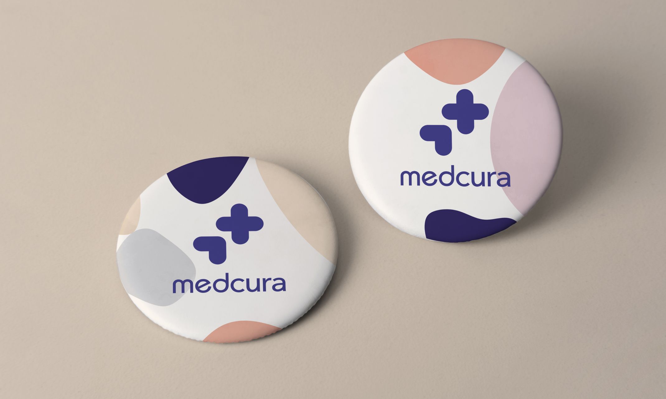
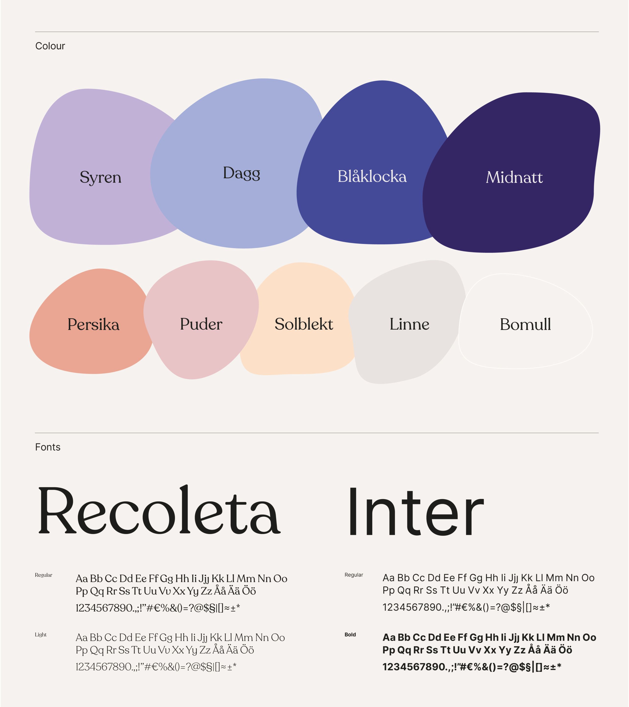
The logo got an update to create more warmth, as well as an inviting and caring color palette. The main typeface Recoleta is a modern classic which has beautiful round features and communicates something timeless and human. The tone of voice for Medcura is uncomplicated, straight forward and honest. If something can be said in a simple way, that’s how it will be said.
The photography puts people first and feels natural, inspiring and including. It portaits a snap shot of the everday life in health care where humans are in focus.
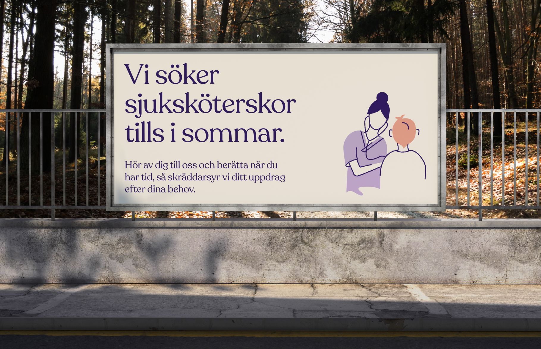
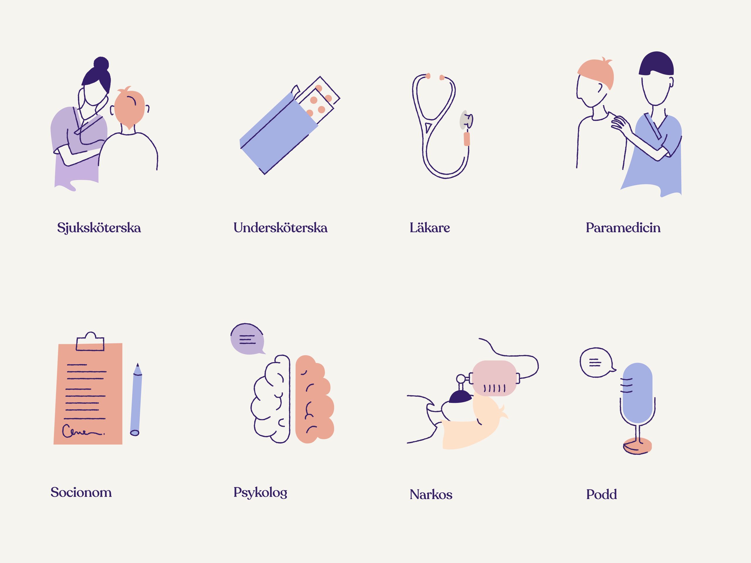
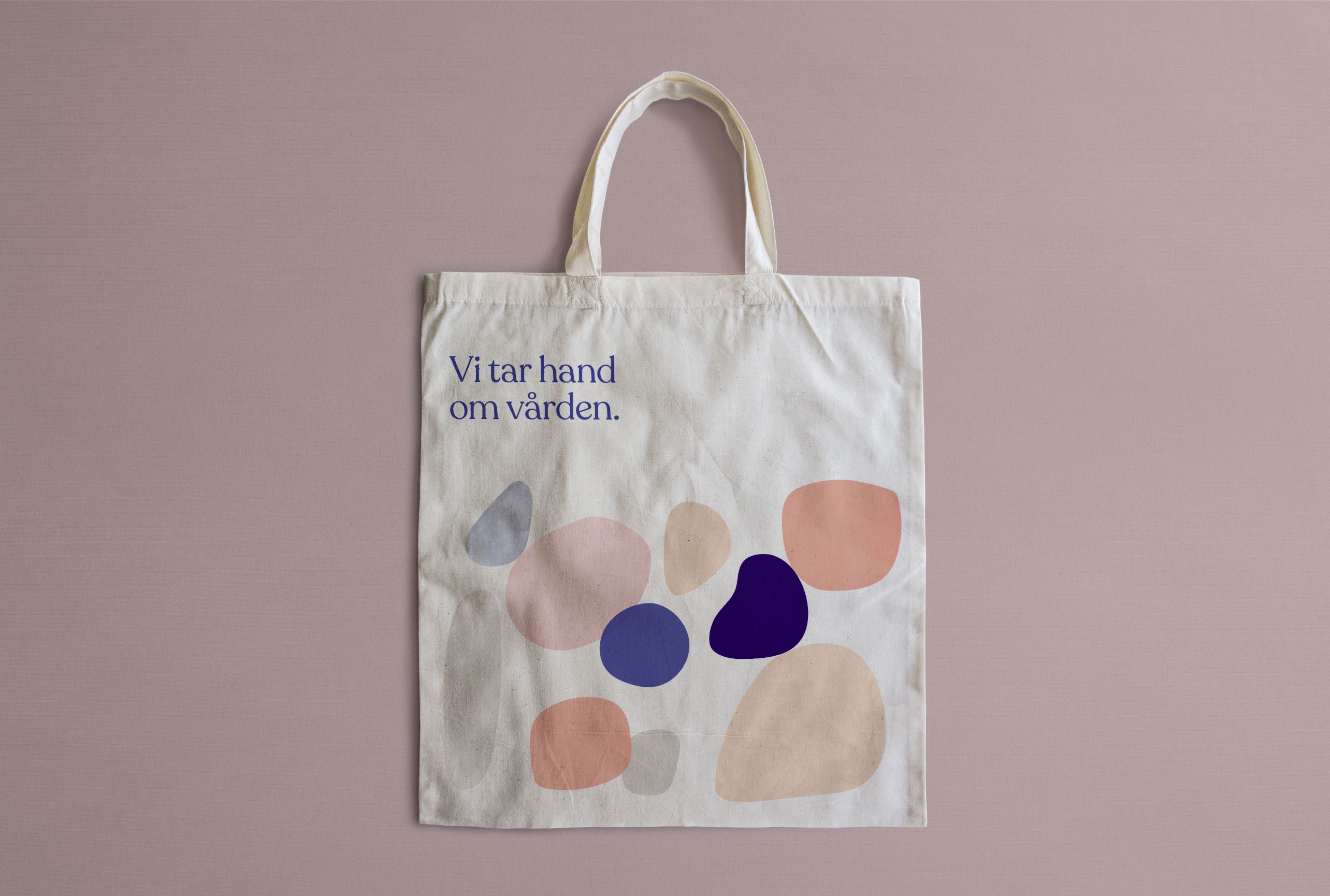
A set of illustrations as well as a pattern was created to add more personality to the brand and to further emphasise a soft and welcoming tonality.
